How to build responsive WordPress sites with Figma
A step-by-step look at designing and building responsive WordPress sites with Figma. Practical tips, advice and best practices for a site that works on every device.
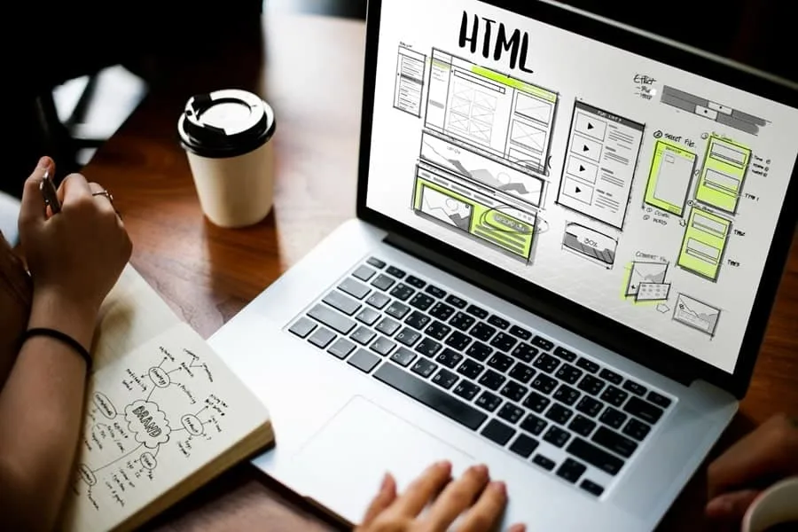
What is a responsive website?
A responsive website is one that adapts its look and layout to the screen size of the device it is displayed on. That means that whether you are using a computer, a tablet or a smartphone, well-made sites built in WordPress or with any other tool will look good and work properly.
Why is a responsive website so important?
There are many reasons why responsiveness is essential:
- It improves the user experience. A user who struggles to navigate a site on their device will probably leave it quickly. A responsive site, on the other hand, is easy and pleasant to use, which raises the chances that the user will stay.
- It affects search rankings. Google has favoured responsive sites in its search results since 2015. So if you want your site to appear higher in search results, it should be responsive.
- It increases reach. More and more people use the internet on mobile devices. If your site is responsive, there is a chance you will reach more people.
An introduction to WordPress, the ideal platform for building responsive sites
WordPress is a content management system (CMS) that lets you create and manage websites without having to write code from scratch. With it, you can build responsive sites that adapt to different screen sizes.
Why is WordPress ideal for building responsive sites?
- User-friendly. WordPress is known for its intuitive interface, which is easy to learn, even for people with no experience in building websites.
- A wealth of themes. It offers thousands of free and paid themes that are already optimised for responsiveness. That means you do not have to worry about adapting the site to different screen sizes: WordPress will do it for you.
- Plugins. The platform has plugins that can help you optimise the site for SEO, improve performance, security and much more.
How do you get started with WordPress?
To start using WordPress, all you need is a domain and hosting. Then you can install WordPress on your hosting and start building pages in WordPress. Choose a theme, add content and start enjoying your responsive site.
Figma: your new tool for designing websites
Are you thinking about creating a website that is not only good-looking, but also functional and responsive? Let me introduce you to Figma, a tool that will revolutionise the way you design websites.
What is Figma?
Figma is an innovative interface design tool that is gaining popularity among web designers. Why? It is simple. Figma offers freedom and flexibility in design that was not available before, letting you create interactive website prototypes in real time.
Why Figma?
- Real-time collaboration. Figma lets a team work on a project together. All members have access to the latest versions of the project, which removes the problem of outdated files.
- Interactive prototyping. With Figma you can create interactive prototypes of your site, which will help you understand how users are going to use it.
- Smooth integration. Figma works very well with other tools, such as Adobe XD or Sketch, which makes moving projects easier.
How do you get started with Figma?
- Sign up on the Figma website and download the app to your computer.
- Go to the “Projects” section and start a new project.
- Use the available tools to design your site. Remember that Figma lets you create interactive prototypes, so do not be afraid to experiment!
- When your design is ready, you can export it to various formats, including HTML, CSS and SVG.
With competition online growing, professional web design is the key to success. Figma gives you the chance to create a site that will not only look good, but will also be intuitive and user-friendly. Is there anything more important?
How do you combine the power of WordPress and Gutenberg blocks to bring a design over from Figma? The process step by step
WordPress and Figma are powerful tools that together can create truly magical websites. But how exactly do you connect these two worlds? The answer is simple: step by step.
Step 1: Prepare the design in Figma
Before we start, let’s make sure our design in Figma is ready. Are all the elements in place? Is the colour scheme consistent? Is the typography readable? If so, we can move on to the next step.
Step 2: Install WordPress with Gutenberg
Now that we have a finished design, it is time to move it to WordPress. For that we need to install and activate the Gutenberg block editor. Why Gutenberg? Because it lets us build pages according to our Figma design while keeping full control over the HTML code.
Step 3: We move the page design over
The time has come for the most important part, which is moving the design from Figma to WordPress. How do you do it? The simplest way is by hand, block by block. To do this, we create a new page in WordPress and add Gutenberg blocks to it that match the elements of our Figma design. Let’s remember to stay consistent and precise, and our WordPress pages will look and work well.
Step 4: Pages in WordPress, we test and optimise
Once our page is ready, it is time for testing. Does everything look the way it should? Is the page responsive? And do all the links and buttons work? If something does not work, we go back to step 3 and fix the errors. Once everything is in place, we can optimise the page for SEO and marketing.
- Prepare the design in Figma
- Install Gutenberg
- We move the design over
- We test and optimise
Remember that moving a design from Figma to WordPress is a process that takes time and patience. But the end result is worth it. So be patient, focus on the details and enjoy your new, professional website!
SEO and marketing: the power of responsiveness and design
SEO and marketing are two key elements that decide how effectively a website is visible online. But how do a responsive site and good design affect that visibility?
A responsive site: your ticket to success
A responsive website is one that adapts its look to the device it is displayed on. Have you ever wondered why that is so important? I think of it like bridges: whether you are a pedestrian, a cyclist or a driver, a bridge should be accessible and safe for you. It is the same with a website: whatever the device, the site should be readable and easy to navigate.
Design: the key to effective SEO
In web design, the most important thing is for sites to be not only visually attractive, but also functional and easy for search engines to index. It is a bit like making a treasure map: if the map is beautiful but unreadable, nobody will find the treasure. And the treasure in this case is your website.
- Use clear headings: they help search engines understand what a given page is about.
- Optimise images: they improve page loading speed, and that affects SEO ranking.
- Use the right keywords: they help search engines understand what information the page contains.
Good website design, combined with responsiveness, builds a strong foundation for an effective SEO and marketing strategy. Remember that your website is not only your company’s business card, but also a tool for increasing its visibility online.
The most common mistakes when building responsive sites: how to avoid them?
Building responsive sites on WordPress is a craft that takes not only skill, but also an awareness of common mistakes. Do you know the most common traps that can spoil your work? Let’s go through them together.
1. Ignoring testing on different devices
Testing is a key part of the website building process. Many creators make the mistake of focusing only on desktop computers. Do you remember that more and more people use the internet on mobile devices? That is exactly why testing responsiveness on different devices is so important.
2. Neglecting site performance
Have you ever wondered how fast your site loads? Performance is a key factor that affects the user experience. Sites that take a long time to load can put visitors off and hurt your SEO.
3. Improper use of media
Images and videos can enrich your site, but only when they are used properly. Files that are too large can slow the site down, while the wrong formatting can spoil the look on different devices.
How do you avoid these mistakes?
- Test, test, test: check your site on different devices and browsers.
- Optimise: use tools for compressing files and improving site performance.
- Use the right formats: remember that not all formats are suitable for all devices.
Remember that building responsive sites is a process. Be patient, learn from mistakes and keep developing. Are you ready to take up the challenge and try to build modern and functional sites in WordPress?
Success stories: how have others used Figma to build WordPress sites?
Building WordPress sites with Figma is one of the most effective combinations in today’s world of web design. But what are some concrete examples of how others have used this tool to succeed? Let me present a few of them.
Case Study #1: Corporate website redesign
One of my favourite success stories is a corporate website redesign project. The design team used Figma to create a new, fresh look for the site. Because the tool is so easy to use, they were able to experiment quickly with different layouts and colours, and then implement the designs directly on WordPress. The result? A site that not only looked great, but also attracted more users and increased conversions.
Case Study #2: Online store
Another example is an online store that needed a new site. The design team used Figma to create responsive page designs that were not only visually attractive, but also intuitive for users. Implementing these designs on WordPress was simple and efficient, which let the store quickly increase its online reach and sales.
Case Study #3: Personal blog
I cannot forget about bloggers. One of them, wanting to stand out from the competition, decided to create a unique site design with Figma and then implemented it on WordPress. The effect? A blog that not only looked professional, but also attracted more readers.
These three cases show how Figma and WordPress can work together to create sites that are not only visually attractive, but also functional and effective. Are you ready to use these tools to create your own success story? See also some examples of my work.