Balansik: two sites, PL and DE, scoring 92 to 95/100 on mobile
I designed and built a website for a functional drinks brand in two language versions. The brand got its own component system, a map of points of sale and animations at no cost to performance.
- Client
- Balansik, functional drinks with adaptogens
- Website
- balansik.pl ↗
- Year
- 2026
- Scope
- Design, WordPress, PL + DE, points of sale map
- Made at
- Kiwwwi Studio
- Mobile performance (balansik.de) 95/100
- Mobile performance (balansik.pl) 92/100
- Total Blocking Time 0 ms
- Accessibility (Lighthouse) 96/100
PageSpeed Insights (Lighthouse), measured on 18 July 2026, both sites.
The challenge: a lifestyle brand and two fast sites
Balansik is a Polish brand of functional drinks with adaptogens, a smart drink with its own tone of voice. The brand sells in Poland and is building distribution in Germany, so from the start I designed a system for two sites: balansik.pl and balansik.de.
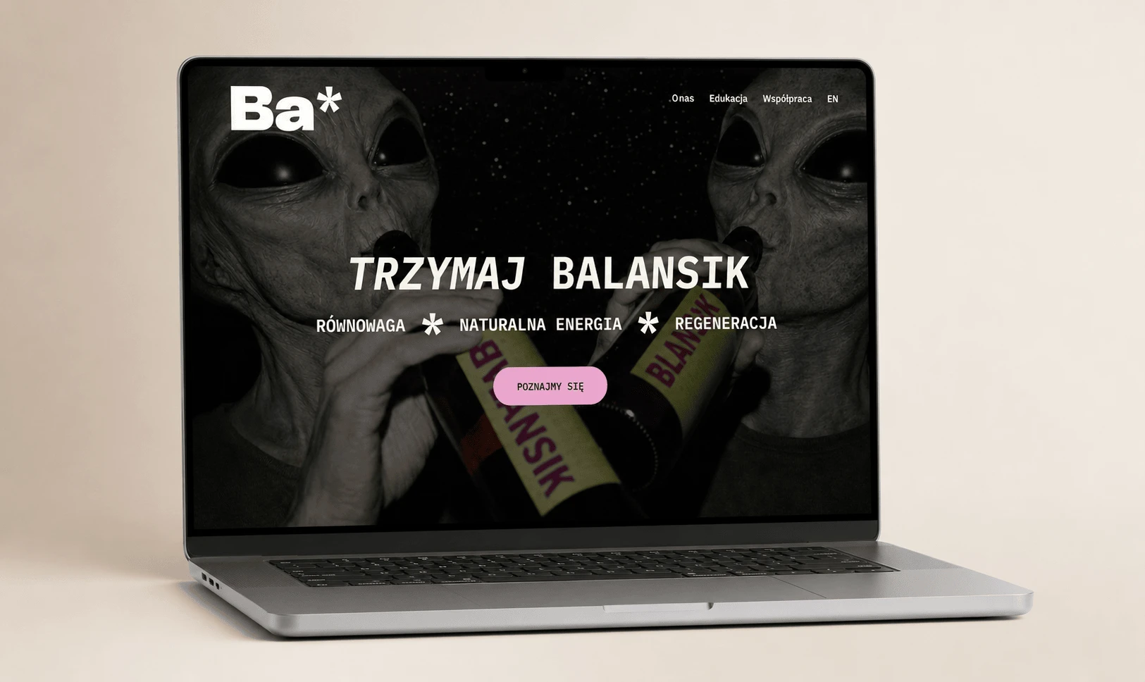
The site was meant to carry the brand’s lifestyle character over to the web. It had to look bold, animate its sections smoothly and load fast on a phone, because that is where most of the audience lands.
The second market also meant separate communication for German customers. The German site was to use the same components and the same quality standard, without doubling the maintenance costs.
- Two domains and two languages: content for Poland and Germany had to live separately, on the same components.
- The brand’s first impression. A bold design and animations could not slow the site down on a phone.
- The question of where to buy the product. The answer had to be on the site, ideally on a map.
- Updating points of sale without my help, straight from the admin panel.
The solution: components, a map and animations at no cost to performance
I built a custom WordPress theme based on Twig + Vite components. The same system runs both sites, and the client can grow the content and the points of sale from the admin panel.
- A custom component theme, in which every section works as a reusable element. A new page is made by assembling ready-made blocks.
- Two languages and two domains, that is balansik.pl and balansik.de as separate sites on a shared standard. The content is independent, while the components and the quality stay consistent.
- An interactive map of points of sale, built on Leaflet. This solution works without API keys and without monthly fees for maps.
- A locations panel, which lets the client add points of sale on their own. Next to the map there is also a section of online shops.
- Scroll animations, made in GSAP and ScrollTrigger. Sections appear smoothly, and Total Blocking Time is 0 ms on both sites.
- An image pipeline, which generates WebP and AVIF at build time. The client’s team does not have to compress graphics by hand.
- Accessibility in the components, that is semantic structure, contrast and keyboard support. Lighthouse rates both sites at 96/100.
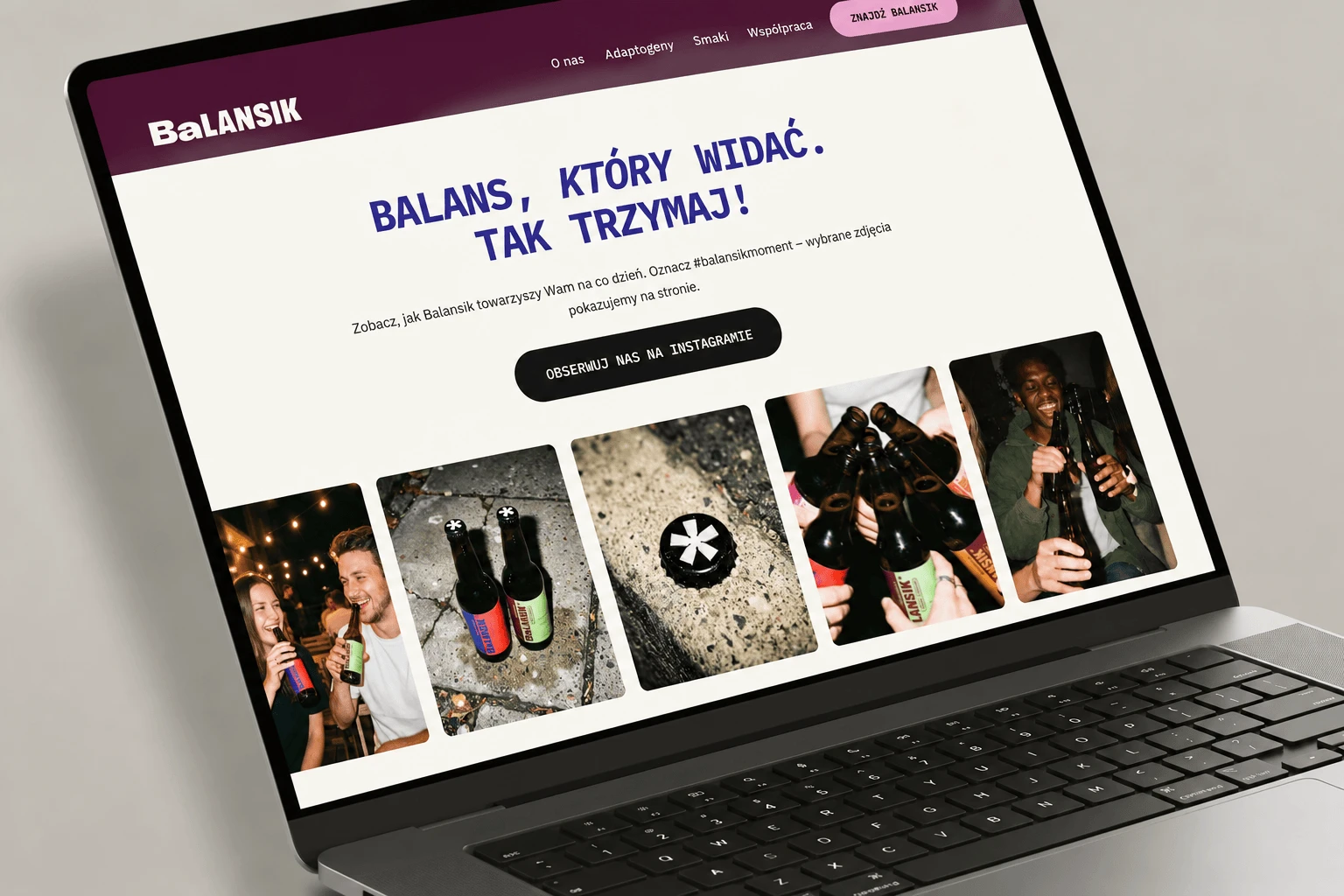
Fig. 1. Mobile view of the Balansik brand site, with a layout fitted to the phone. Mockup made with the help of AI. The site shown is real.
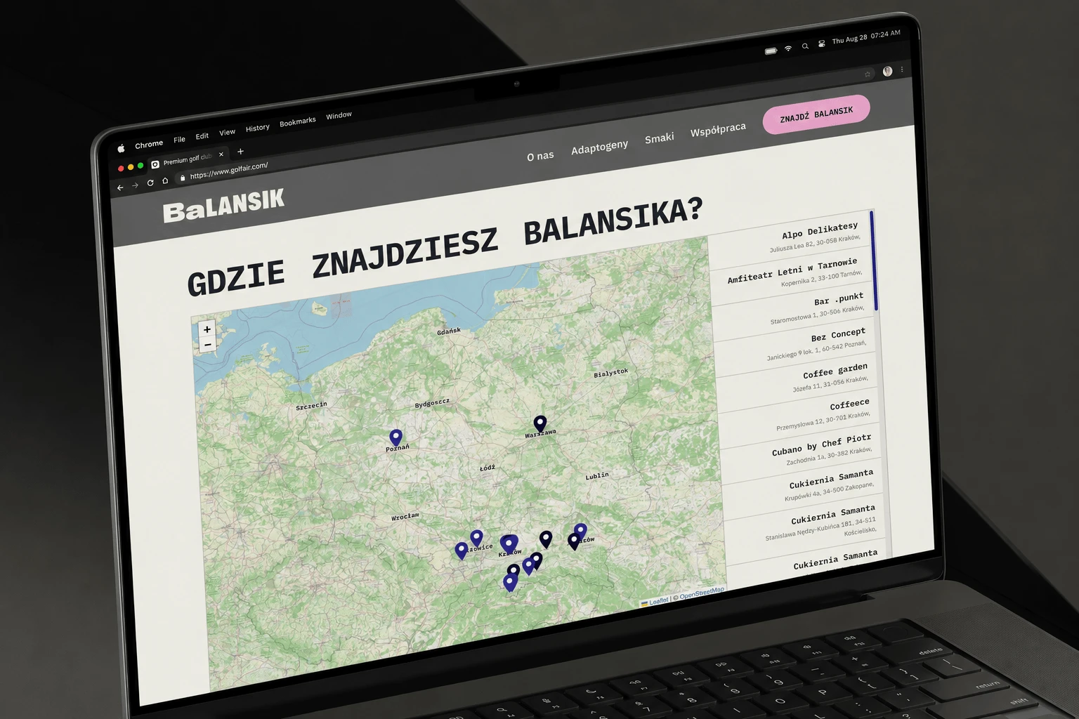
Fig. 2. The Balansik product section with animations and the brand’s character. Mockup made with the help of AI. The site shown is real.
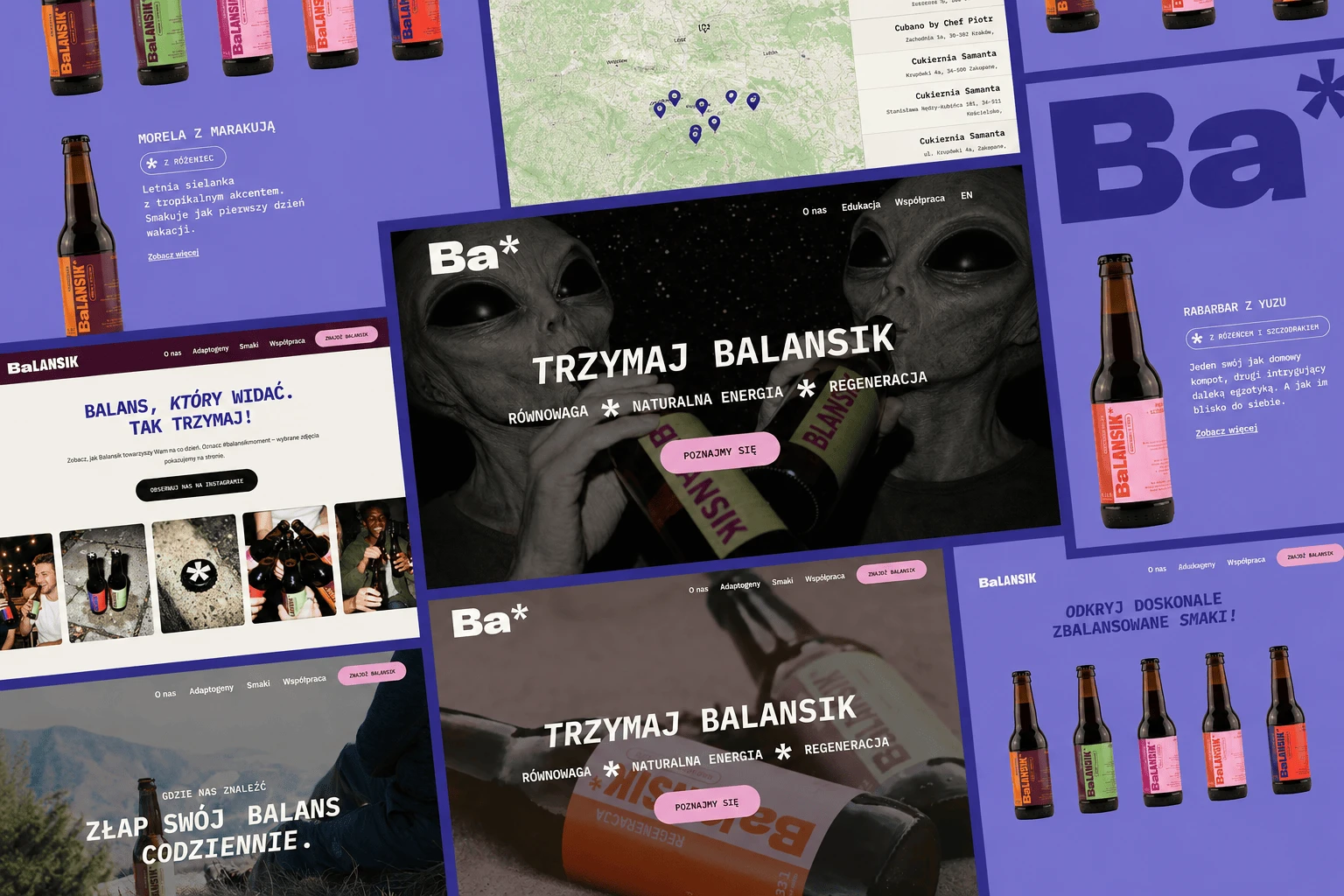
Fig. 3. The German version, balansik.de, based on the same components. Mockup made with the help of AI. The site shown is real.
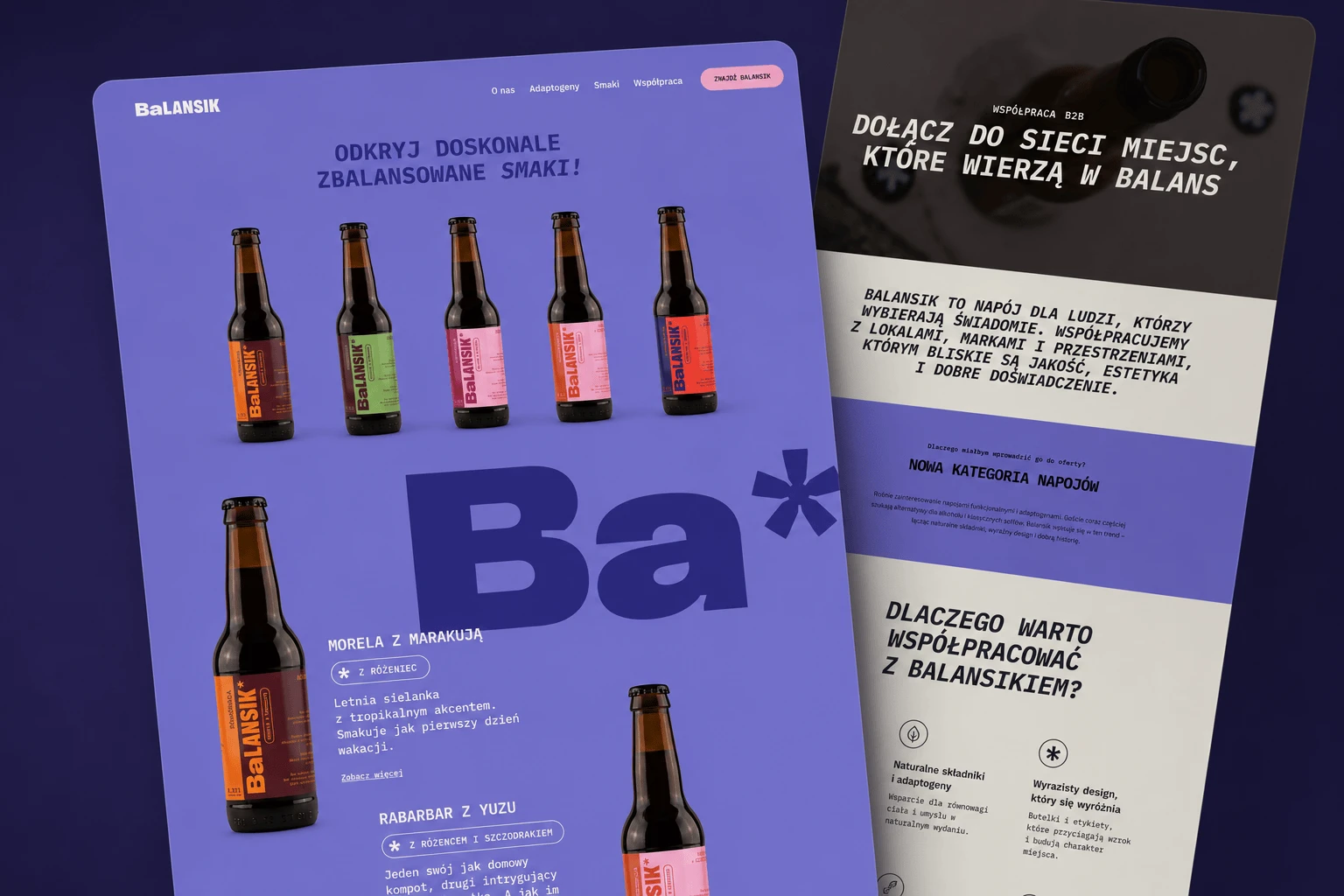
Fig. 4. The Balansik page about adaptogens in the desktop view. Mockup made with the help of AI. The site shown is real.
Results: fast sites in the Lighthouse measurement
The table shows PageSpeed Insights results for the Polish and German versions of the site.
| Metric | After |
|---|---|
| Mobile LCP | 1.4 s (PL) · 1.6 s (DE) |
| Cumulative Layout Shift | ≤ 0.004 |
| Best Practices | 100/100 (both sites) |
| Desktop performance (balansik.de) | 93/100 |
PageSpeed Insights (Lighthouse), measured on 18 July 2026, both sites.
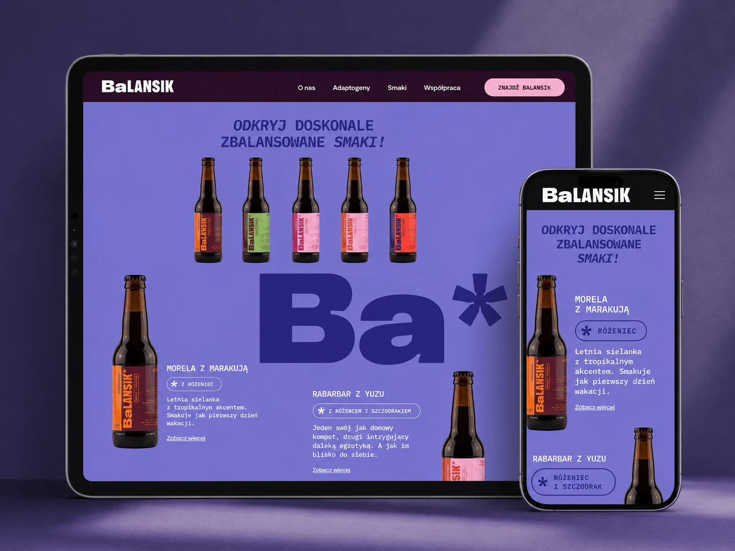
Fig. 5. The interactive Balansik map of points of sale, with shop locations. Mockup made with the help of AI. The site shown is real.
Scope of work
Next project